ShopDreamUp AI ArtDreamUp

Deviation Actions


Suggested Deviants


Suggested Collections


You Might Like…


Featured in Groups


Description
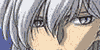
not much to say here, I'm awfully proud of this picture, however I am aware I lack practice with backgrounds. if you see something you don' like please tell me so I can correct it ^^
I learnt a lot while doing this piece and hope to do more like it in the future. IF anyone would like a print or a poster, you can preorder at a discount since Until january 1st all posters are $8 prints come without watermark (unless you want it)
I look forward to your responses so that I may grow as an artist, and I wish all of you the best of luck in the upcoming new year (Smile)")
Other K related art:

I learnt a lot while doing this piece and hope to do more like it in the future. IF anyone would like a print or a poster, you can preorder at a discount since Until january 1st all posters are $8 prints come without watermark (unless you want it)
I look forward to your responses so that I may grow as an artist, and I wish all of you the best of luck in the upcoming new year
Other K related art:
Image size
2100x3000px 1020.73 KB
© 2012 - 2024 KuraiDraws
Comments66
Join the community to add your comment. Already a deviant? Log In
Over all this is quite a piece. Here is my views on it, please, accept them with a grain of salt in that I don't know the full intent you put in. I'll say what I like, and what I think could be touched up, and a way I think it could be achieved. I intend no insult, and I hope I don't offend you in any way.
The colors are vivid and complement each other nicely. The hair looks very detailed and realistic, giving a nice effect. The eye style is well chosen for his face. The affect of the light orbs by the hand makes it look like a photograph nicely. The background is nice. It doesn't have a lot of details that overbear on the person, yet still gives the effect of being on a roof.
The big things that negatively stand out to me are his lips and the light source in the top right. The lips don't look quite pronounced enough for him. A little shading under his bottom lip and the philtrum isn't visible, throwing off the effect I see, and again, just a little shading could fix this. The light in the top right, to me, distracts from figure. The light could be implied in a way that it doesn't distract from the rest of the image. Moving the light off screen and letting the ambient glow show would do this. The next thing for me is his neck loops, they look a bit squared, and this maybe what you were looking for, but they would normally fall more circularly. My final bit would be that the person is a bit too centered, meaning I believe he is too close to the center to draw a lot of attention. Something like this you could shift the figure over so he is off-center on both axis. By moving him to the right a little you could capture more of hi hand and show the item off some more as well.
Again, this is a nice work, and this critique is just my views and opinions. Please, take this with a grain of salt. ^_^